Bär Shoes
Optimized Purchase Funnel to Maximize Conversion and Reduce Cart Friction

The user funnel revealed a critical bottleneck at the “Add to Cart” stage, where only 7.21% of users who view items actually add them to their cart, representing a massive 92.79% drop-off. Mobile drives most traffic, with nearly 95% of users dropping off at this point.
solution
To tackle the substantial drop-off at the “Add to Cart” stage, especially on mobile, the checkout experience is reimagined to remove friction and eliminate unnecessary steps. The redesigned flow emphasizes speed, simplicity, and clarity.
Impact Metrics
BÄR is known for making comfortable shoes, so buying them shouldn’t be the hardest step.

A UX audit was conducted by analyzing user behavior through heatmaps and session insights, alongside identifying heuristic usability issues in the interface. This step helped uncover where users hesitated, dropped off, or struggled to complete actions, allowing us to understand friction points and usability gaps that were not immediately visible through design alone.
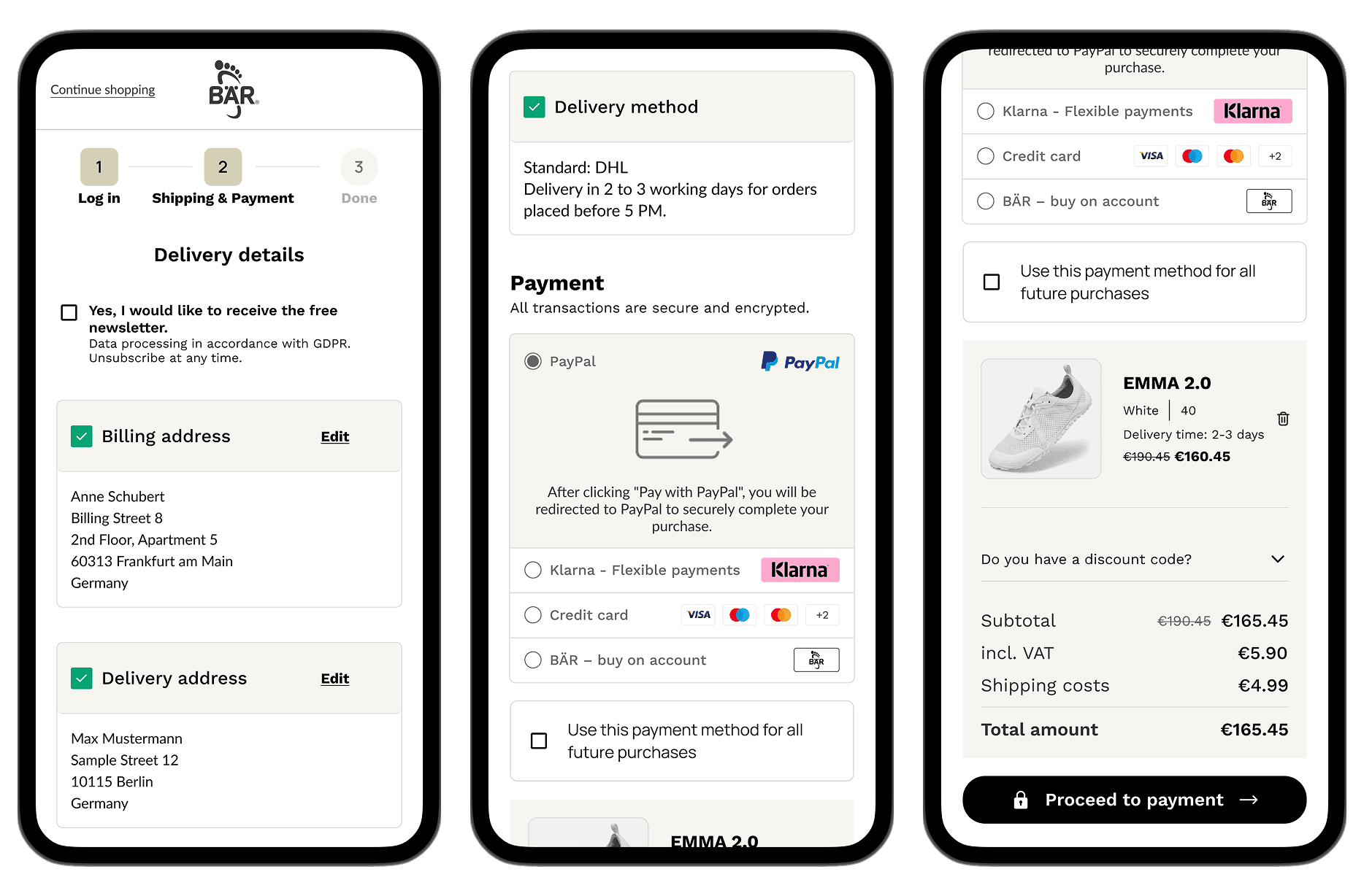
Reducing Friction in Checkout Flow
(Before) The checkout suffered from poor visual hierarchy, with cluttered and repeated information that confused users. Cluttered content and repeated information in the checkout reduced clarity and increased user confusion.

(After) The redesigned cart follows a more structured layout that helps users quickly identify important information. By clearly surfacing key details such as pricing, product summary, and next steps, the design reinforces purchase decisions, gently nudges users to continue to checkout, and creates space for relevant upsell offers without overwhelming them.
Redesigned Checkout is optimized for clarity with:
#1 Progress Tracking: The step indicator at the top reduces "checkout anxiety" by showing the user exactly how close they are to finishing.
#2 Express Payment Prominence: Placing PayPal and Klarna buttons at the top caters to mobile users who want to skip tedious form-filling.
#3 Low-Friction Upselling: The "Other items" section uses a simple "Add" button, allowing users to increase their cart value without leaving the checkout page.
#4 Guest Checkout Option: Including a "Pay as a guest" path prevents losing customers who don't want to create a permanent account.
#5 Price Transparency: The clear breakdown of VAT, shipping, and discounts builds trust and prevents "sticker shock" at the final step.
The original checkout lacked clear security cues and progression, leaving users uncertain about their order and data safety. The redesigned flow builds trust through visible edit options, clear encryption messaging, delivery timeframes, and an order summary that keeps key details near the payment action.
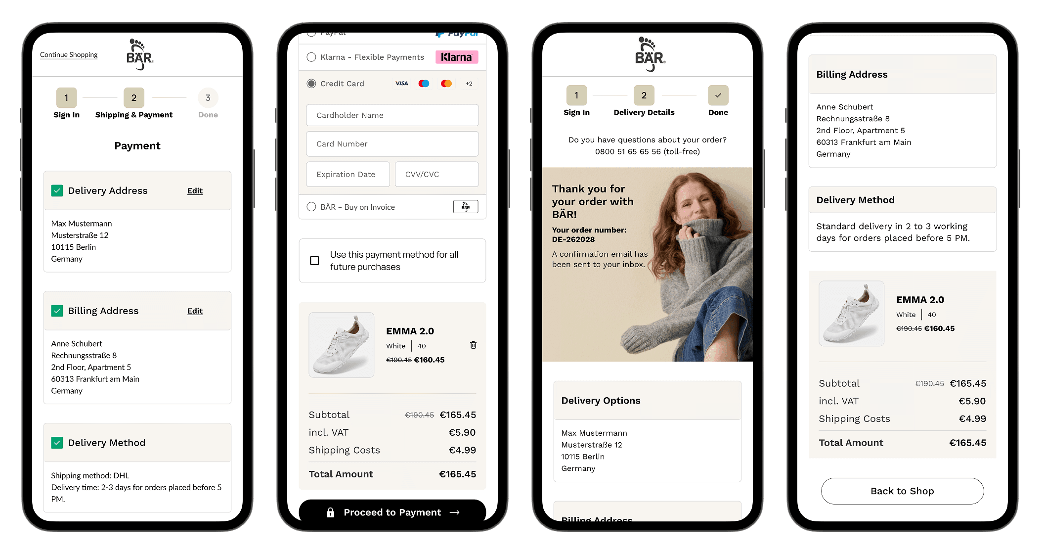
The flow consolidates key information into a single, clear view. Editable addresses reduce errors, and highlighted delivery methods and timeframes set accurate expectations. The order confirmation emphasizes clarity, with the order number and a prominent “Thank you” atop a progress tracker. At the same time, white space and distinct blocks make details easy to scan on mobile.
Results
METRIC | BEFORE | AFTER | IMPROVEMENT |
|---|---|---|---|
User Conversion | 49% | 74% | +50% |
Purchase Efficiency | 48% | 92% | +92% |
Cart Noise | 33% | 25% | -24% |
The cart and checkout redesign didn’t just boost engagement, it structurally improved buying efficiency, reduced friction, and strengthened purchase intent, driving more committed purchases per cart interaction.
see also

