VDO Fleet Management
Worked with Continental’s mobile apps team on VDO Fleet, a fleet management app for drivers and fleet operators across Europe.

problem
EU truck drivers use digital tachographs (DTCO) to record driving and rest times, but data access has traditionally relied on separate tools and manual workflows. The challenge was turning a complex, compliance-heavy system into a simple mobile experience for both drivers and fleet managers.
solution
VDO Fleet is a single app serving two users: drivers and fleet managers. Drivers get quick, glanceable compliance tools, while managers get live fleet oversight via a map view. My role focused on shaping UX, translating features into the system, and iterating through Lean UX, simplifying a legally complex product without losing critical detail.

🛈 A UI/UX case study from my internship, told within the limits of an NDA.
My Process
Learning the system before designing in it
I spent time understanding Continental's existing component library and how it mapped to Material Design 3, what could be reused, what needed to be adapted for the fleet/tachograph context, and where the brand's own conventions overrode default Material Design patterns.
Co-creating through Lean UX
Rather than designing in a vacuum, I facilitated and participated in Lean UX sessions with the broader project team, developers, and product owners to collaboratively shape solutions for planned features. We sketched options live, stress-tested assumptions with the people who understood the regulatory and technical constraints best, and converged on a direction the whole team had a hand in.
Designing, presenting, iterating
For each feature I worked on, I produced screen designs in Figma, then presented them back to the team for critique. Feedback wasn't a formality; it regularly reshaped flows, especially around how much information to surface to a driver at once versus how much to progressively disclose.
The UX Principles That Drove Every Screen
These are the principles that shaped the choices throughout the project:
Clarity under real-world pressure
A driver checking the app is often doing so in a cab, between tasks, sometimes with limited connectivity. Every screen needed to communicate status — compliance, downloads, and remaining drive time at a glance.Trust through consistency
Tachograph data carries legal weight; if the interface feels inconsistent or ambiguous, it undermines trust in the data itself. Sticking to the design system reinforced reliability, not just polish.Two audiences, one system
Driver-facing flows and fleet-manager-facing flows needed to feel like the same product family while serving very different mental models and contexts of use.Progressive disclosure for regulatory complexity
Where legal or technical detail was unavoidable, the goal was to surface only what the user needed to act in the moment, with more available on demand.
🛈All screens shown are publicly available or cleared for sharing.
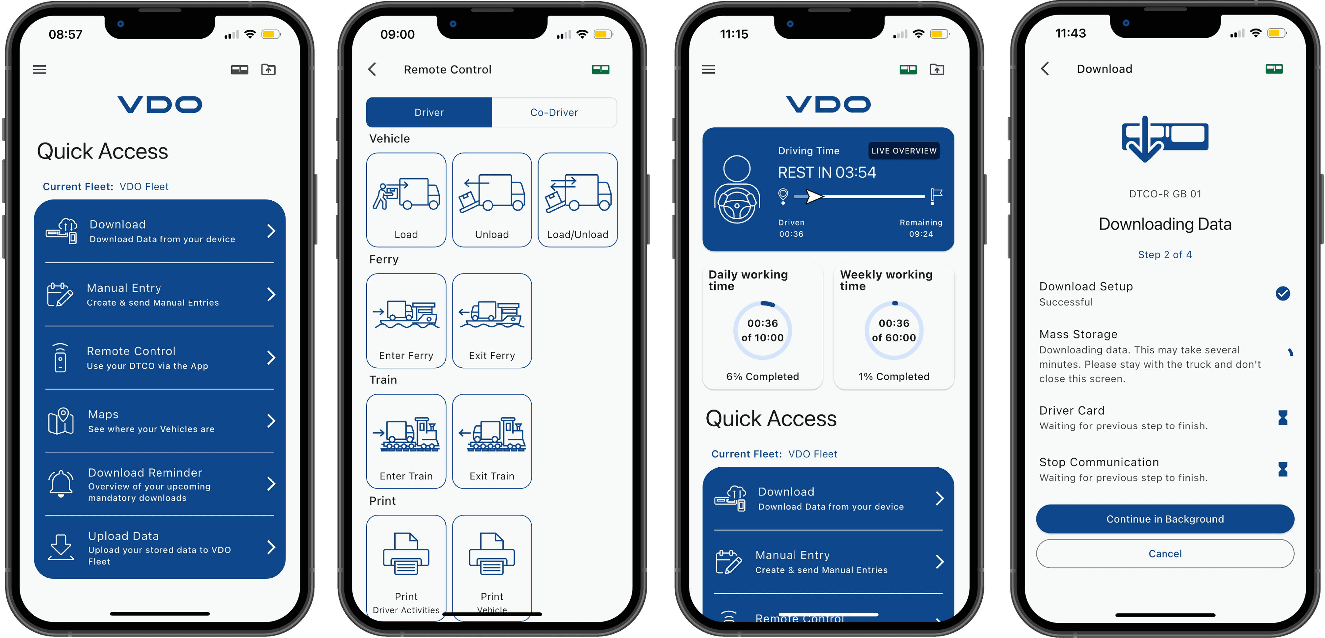
A consolidated entry point for the six most frequent driver actions: download, manual entry, remote control, maps, reminders, and upload. Designed to surface the right task fast, with minimal navigation, for a user who opens the app with a specific job already in mind. A remote control panel letting drivers trigger tachograph events, loading, ferries, trains, and printing directly from the app rather than the in-cab hardware.
The driver's home screen is anchored by a live driving time card showing time driven, time remaining, and the next required rest. Daily and weekly working time rings give compliance status at a glance. Quick Access shortcuts below reduce the steps needed for the most frequent driver tasks.
A stepped download flow showing real-time progress across four stages: setup, mass storage, driver card, and communication. The "Continue in Background" affordance reflects a key insight: drivers can't be expected to wait idle in the cab, so the flow needed to stay transparent while releasing them to move.
Key Learnings
Designing inside a system is its own skill
Working within Continental's component library and Material Design 3 taught me when to reuse, when to adapt, and when (rarely) to deviate and why that judgment matters at scale.Lean UX turns a room into a direction
Facilitating workshops showed me how to take a room full of different perspectives — engineering, product, design and converge on a shared next step quickly.Good design survives without you in the room
Working across time zones meant my rationale had to be clear enough to stand on its own during async handoff, a habit that's stuck with me since.


